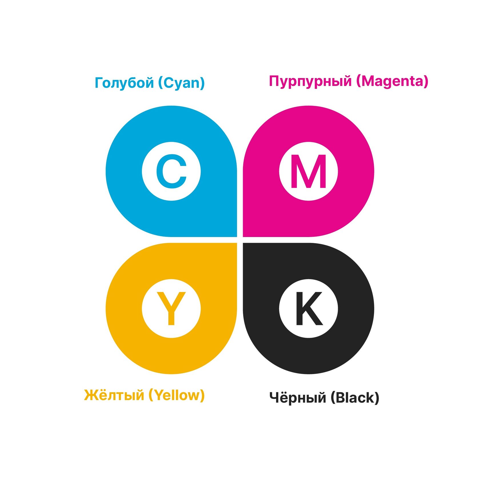
CMYK
The color model used in printing includes Cyan (Cyan), Magenta (Magenta), Yellow (Yellow) and black (blacK) colors. The CMYK code is a recipe for mixing paints to get the right shade.
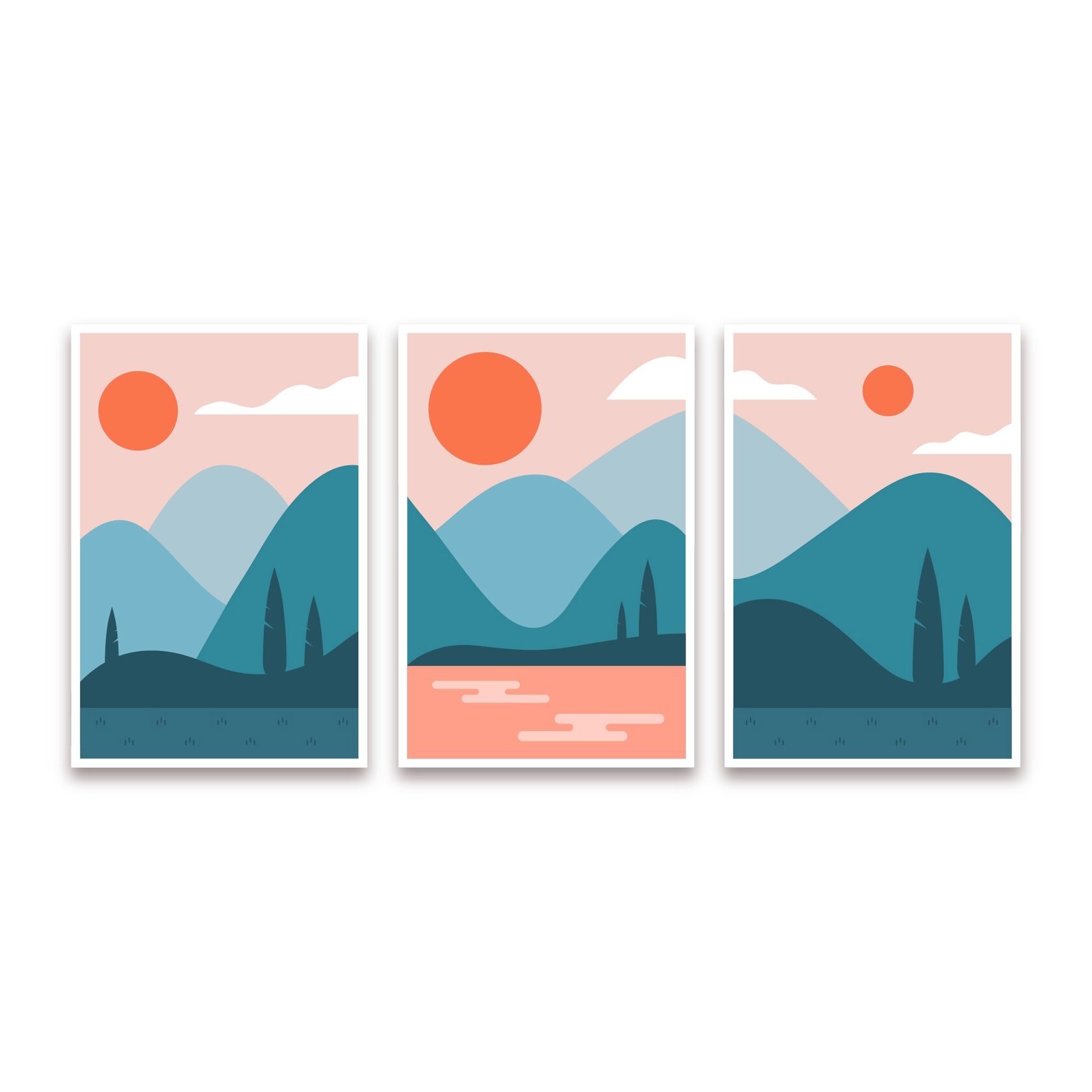
Flat design
A design style that uses simple flat shapes, bright colors, and minimal detail.
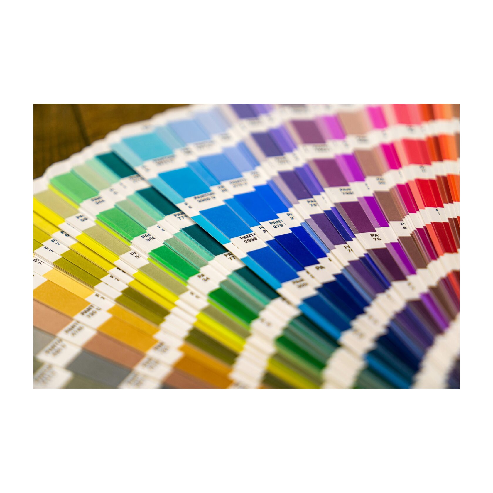
Pantone
A standardized color system that helps you accurately select and convey the desired shade. It is, in fact, a universal language of color, understandable to designers and printers.
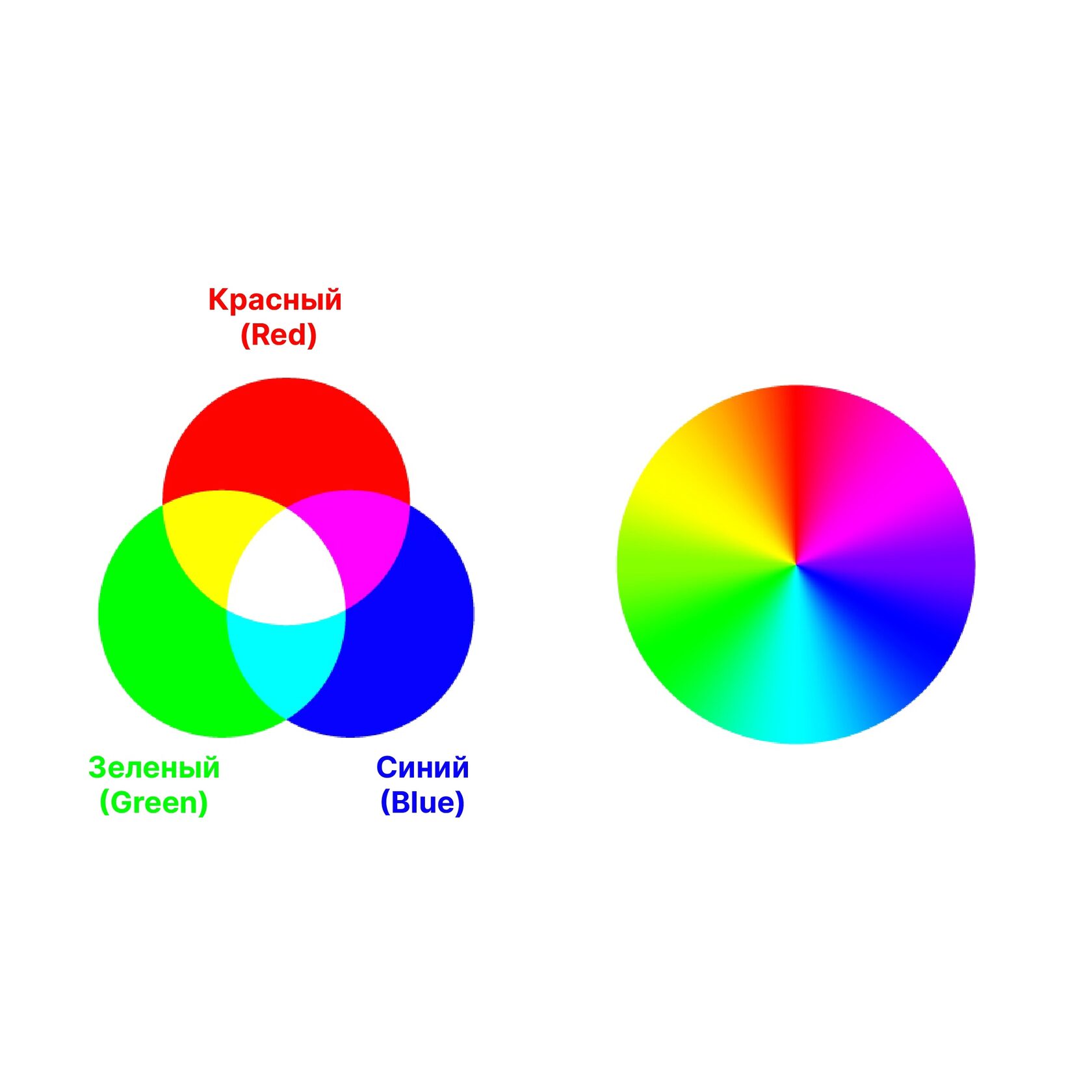
RGB
This is an abbreviation of the English words "Red, Green, Blue" — red, green, blue. A color model that is used in electronic devices (on monitors) and includes red, green, and blue colors. These magic lanterns mix the light to get different colors on the screen.
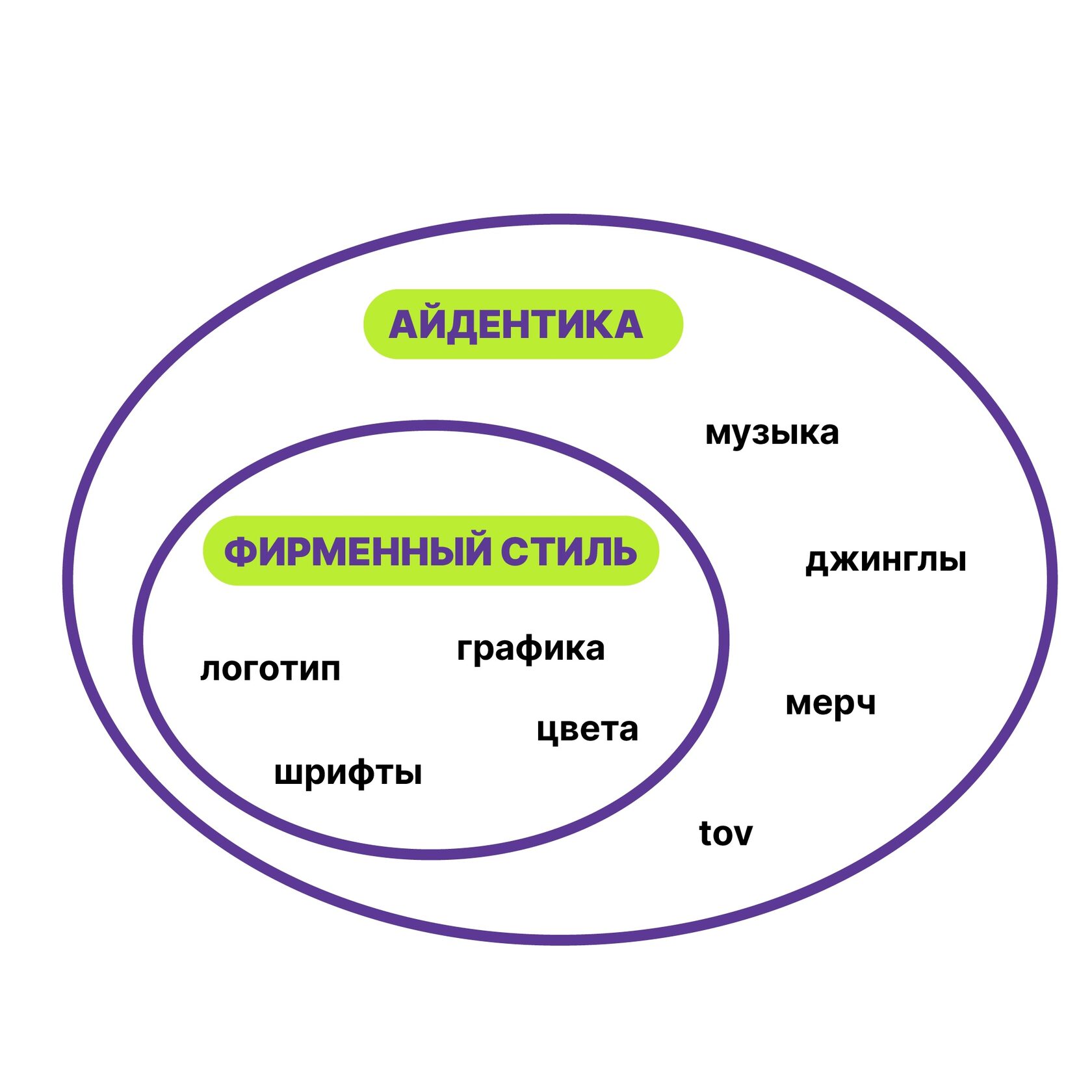
Identity
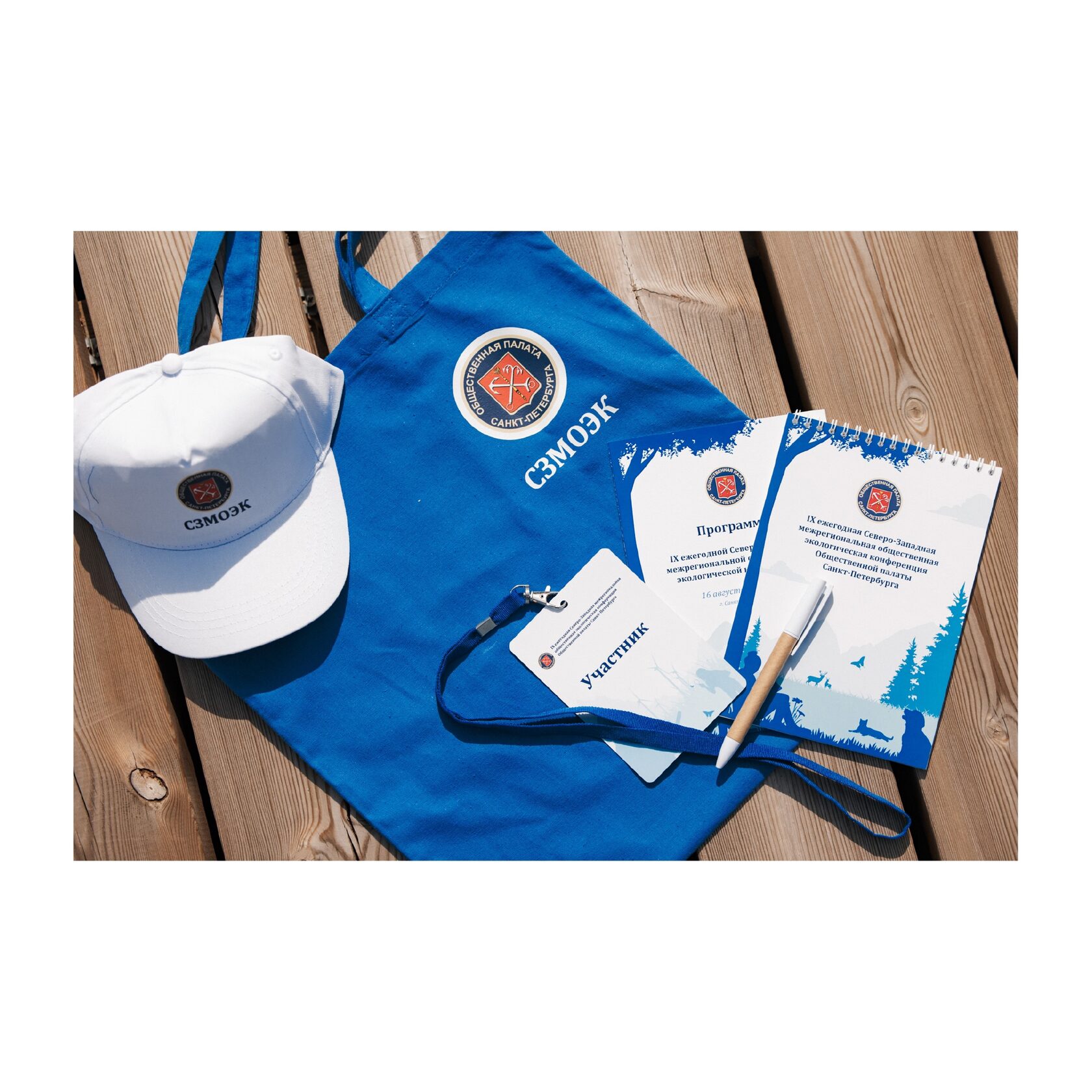
An image of a brand or company that includes not only visual elements, but also communication strategies, mission, values, and other aspects of the brand. This is the basis for the formation of the company's image and its interaction with customers and partners. The elements of identity are corporate identity (visual representation), merch and promotional materials (material embodiment) and communication (video, audio products, etc.).
Brandbook
A brandbook is a special document that contains all the important rules and recommendations for using a company's corporate identity. It helps to maintain a unified brand image in all its manifestations.
The main elements that a brandbook usually includes:
A brandbook is needed to ensure that all employees of the company, as well as contractors and partners, use a single corporate identity.
The main elements that a brandbook usually includes:
- Logo: what it looks like, what colors are used, how it can and cannot be used.
- Colors: the main corporate colors and their codes to always use them.
- Fonts: which fonts are used in the design, for headings and main text.
- Image and photo style: which images are suitable for the brand and which are not.
- Rules for registration of documents, presentations, and promotional materials.
- The tone of communication: how the brand should communicate with customers, what words and phrases to use.
A brandbook is needed to ensure that all employees of the company, as well as contractors and partners, use a single corporate identity.
Visual hierarchy
The basic design principle, which determines the order of placement of various elements in the design according to their significance and facilitates the delivery of information.
Logo inversion
Using a white or light logo on a dark background. This is the negative of the image, which creates contrast and highlights the logo.
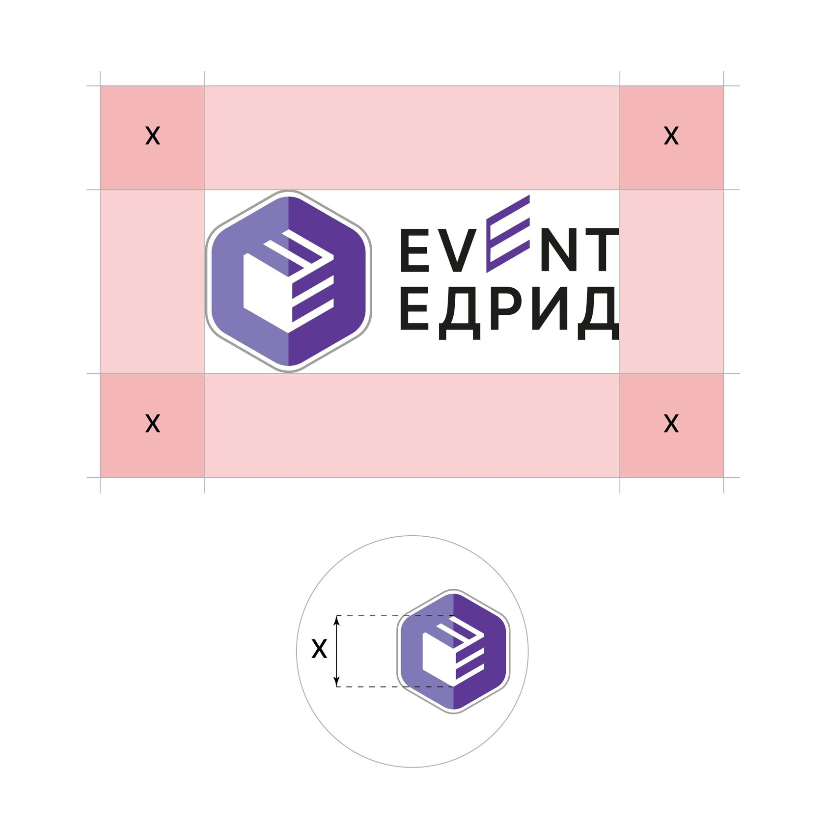
Departures (or "cut-off")
This is the area outside the visible part of the design that will be cropped after printing or production. Designers add overhangs to avoid unwanted white edges if small deviations occur during cropping. The spans are usually about 3-5 mm outside the visible area of the design.
The gradient
Smooth transition from one color to another. It looks like a sunset or dawn, where the colors of the sky imperceptibly change each other.
Prepress preparation
Prepress, or prepress preparation, is the process of preparing a design layout for printing. It includes a range of rendering, control, and layout testing activities. Prepress is required for any printed product, from a business card to an advertising banner. Prepress is an important stage in the printing process, which allows you to evaluate the compliance of the design layout with the technical requirements of the printing house. It helps to avoid problems related to the discrepancy between the size of the layout and the capabilities of the printing equipment. Sometimes customer layouts do not take into account print width restrictions, which can lead to cropping of important design elements on finished products and, as a result, to the rejection of the entire print run.
Thanks to the press, it is possible to identify such inconsistencies in advance and make the necessary adjustments to the layout. By the way, at EDRID EVENT we pay close attention to prepress preparation so that any layouts come to life just perfectly.

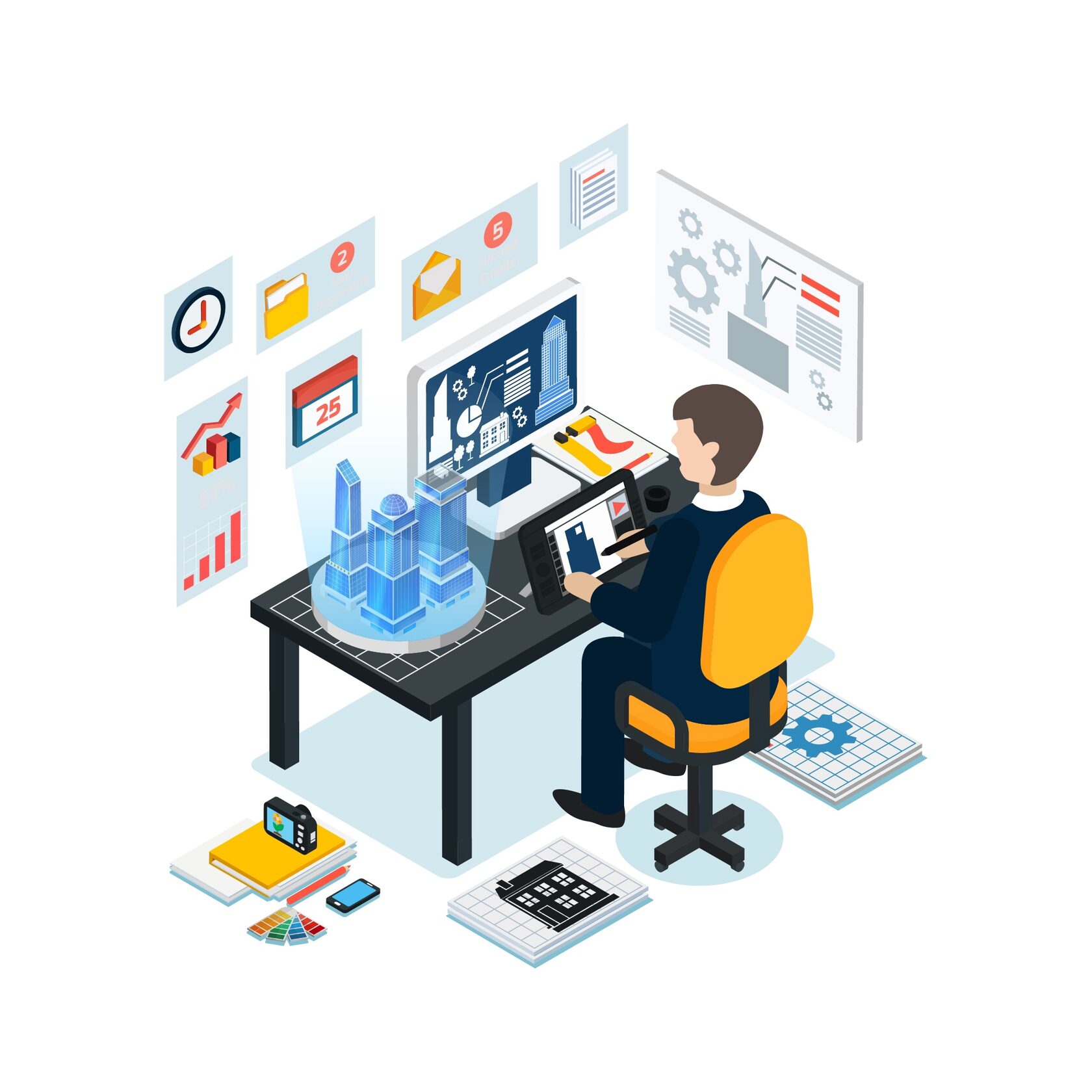
Isometry (isometric design)
Isometric art is a style of drawing or illustration that makes two—dimensional shapes appear three-dimensional. From the Greek word for "equal measure," isometric images can illustrate interiors, exteriors, objects, or logos with height, width, and depth to create the illusion of a three-dimensional perspective.
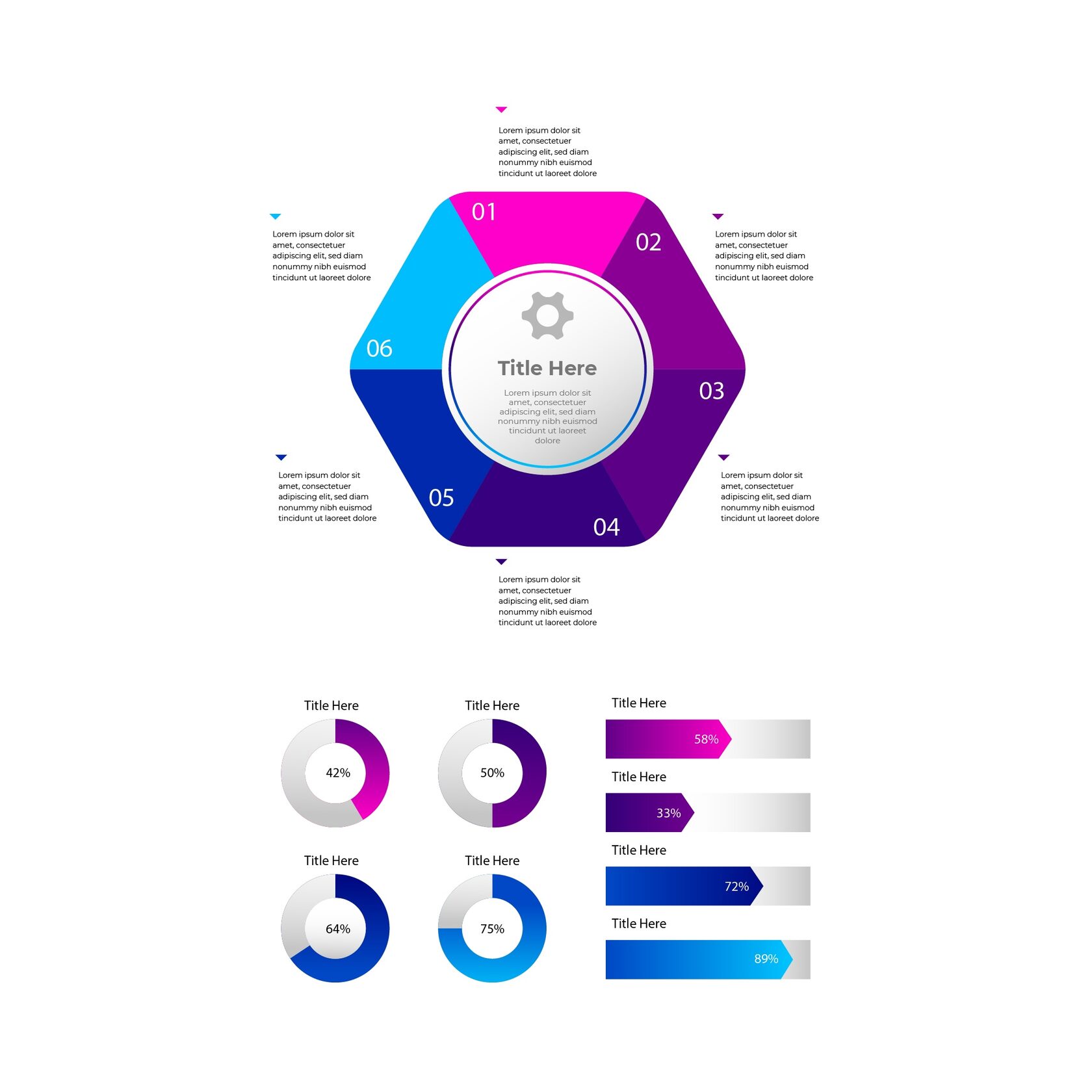
Infographics
A graphical way of presenting information that combines text, images, and diagrams. This is a fascinating story in pictures that helps you understand complex data quickly and easily.
Size
This is what designers call the font size, which is measured in typographic points (pt). One point is approximately 0.353 mm. For example, a 12 pt font will have a height of about 4.23 mm. The larger the size, the larger the text will be. Choosing the right font size is important for legibility and visual hierarchy in a design.
Key Visual
The main visual element that reflects the essence of your event. It can be a character, a symbol, or an image that attracts attention and is memorable. Usually, the key image is repeated in most of the materials that make up the event.
Co-branding
Joint promotion of two or more brands at the same event. Companies are teaming up to make the event even more interesting.
Legend
Explaining the meanings of symbols, colors, or infographic elements. This is a dictionary that helps you decipher visual language.
Logo
A unique graphic sign or logo that represents a company or event.
Layout
A preliminary sample or design sketch that shows what the final product will look like. It can be a hand-drawn drawing, a digital sketch, or even a physical model. The layout is used to visualize and plan the design before it is implemented.
Security field
Free space around the logo, where other elements cannot be placed. This is necessary so that the logo stands out well and is legible.
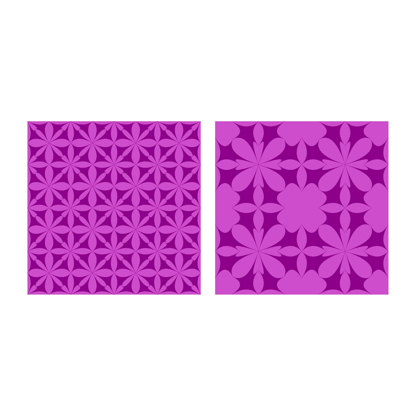
The pattern
A repeating graphic element that creates a pattern or background. A pattern is a kind of wallpaper for the "interior" of your event.
Pictographs
Simple graphic symbols that convey information without words. A sign language that everyone understands.
Timeline
Graphical representation of the sequence of events in time. This is a story feed that highlights all the important points.
Typography
The art of text design, which includes choosing fonts, sizes, colors, and locations. For a document or presentation material, typography is a beautiful handwriting that makes everything written attractive and easy to read.
Corporate identity (first style)
Part of the brand's identity, a unified visual style of all brand elements, from the logo to souvenirs. It includes all graphic elements (logo, fonts, color scheme). A kind of company wardrobe where everything fits together and complements each other.

The color scheme
A set of colors that are used in the design and create a mood. The color scheme of the event is like a palette for an artist, where each shade has its own meaning and character.
Color correction
Adjust the colors of the image to make them more natural or expressive. As a result of the work on color correction, it turns out to make drawings, graphic elements more vivid and colorful.

Color test
The most important stage of polygraphy preparation! If you don't want the picture on your computer monitor to turn out to be "completely different" on a piece of paper or on a T–shirt, be sure to do color tests.
In a broad sense, a color test can be called any image that the print customer considers to be a color sample: a print on a printer or an original photo, even a product sample for a catalog. However, the printer will rarely be able to "get" into the proposed image if the realities of the printing process were not taken into account when preparing it: the paper and ink used, the features of the printing machine and prepress preparation.
With care, your EDRID Event